Consciously Direct Your Viewers Emotions: Color Psychology For The Photographer
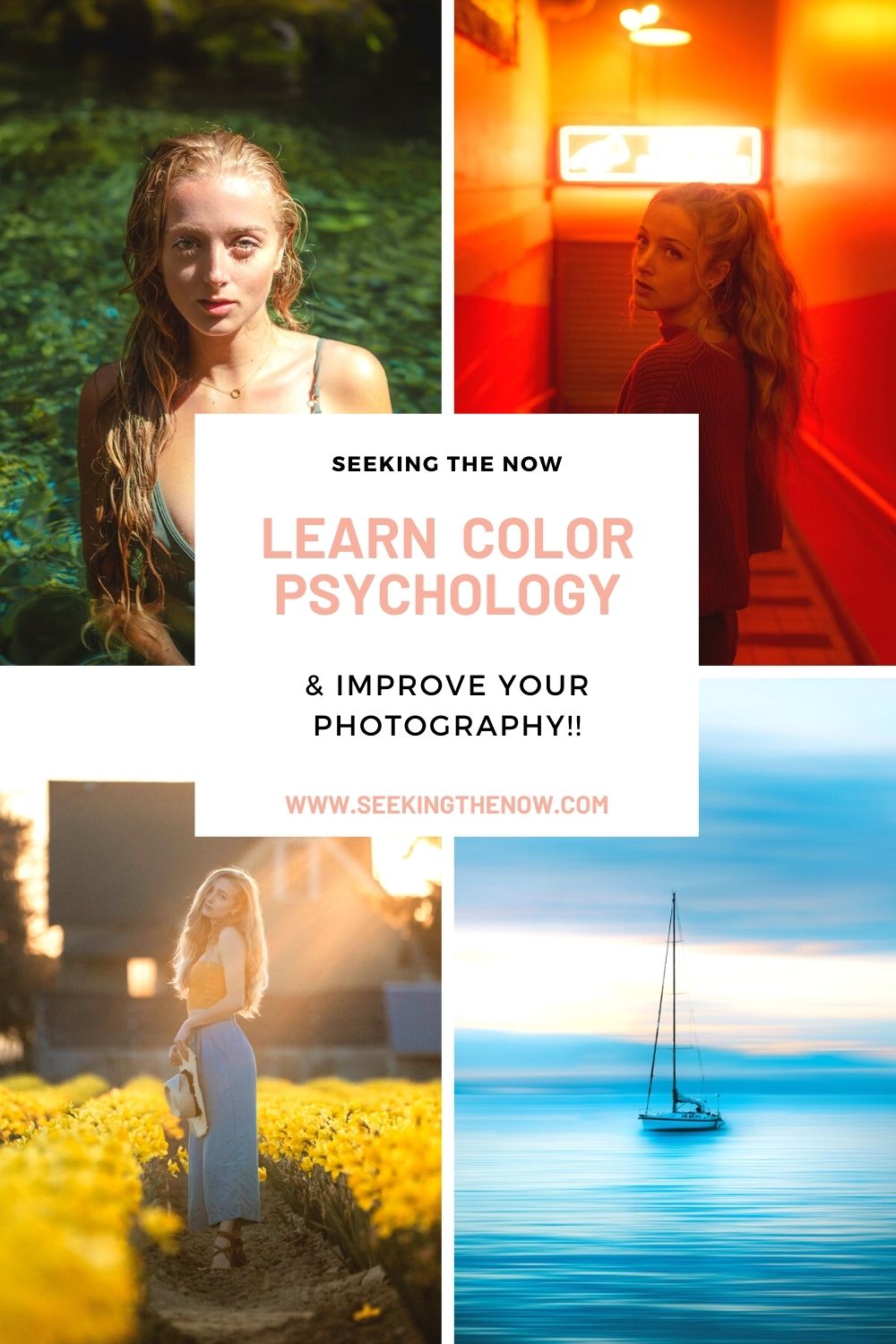
Don’t have time to read it now? Save it for later!
The power that comes with color is immense.
Do you want to calm your viewer?
Induce excitement and raise their blood pressure?
Or take their minds to a higher level?
Color can help you do that.
By simply understanding the principles of color psychology photographers can guide their viewers to any emotional destination they choose.
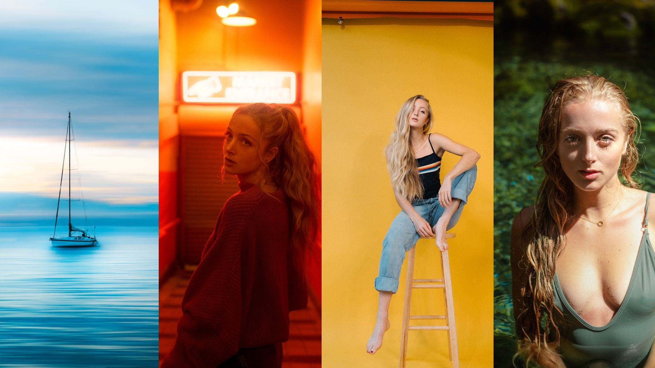
What Is Color Psychology?
In simple terms, color psychology is the study of how different color hues affect human reactions.
We as humans, are used to perceiving different environments and images based off of the dominant colors that are used.
Change the color and you change the meaning.
Because of this, color has become strongly attached to the emotion that we feel while viewing a piece of art or a film.
It has been found that different hues strongly affect not only our emotional responses but our physical responses as well.
This response can range from something as small as an increasing heart rate, to a substantial increase in productivity.
Some colors make us hungrier, others make us calmer, and still others make us more focused.
Color psychology can be used in photography to help us guide our viewer into the emotional response we desire.
A solid understanding of color psychology can allow you to make conscious decisions about the colors you decide to use in your work.
If you can master color, you have one more tool in your toolbox that allows you to influence your viewer to the desired response.
Specific Colors: How Do Different Colors Affect Us?
Each color has it’s own specific flavor if you will.
We translate color through wavelengths- different wavelengths will affect us in different physical ways.
Emotionally and mentally, each color has cultural associations built into it. Overtime, we have come to understand different colors to mean different things.
Culturally, each group will have a variation of meanings for each color. This article will discuss the western understanding and associations of each color.
Primary Colors
Primary colors are the three colors (red, blue and yellow) that mixed together make all other colors.
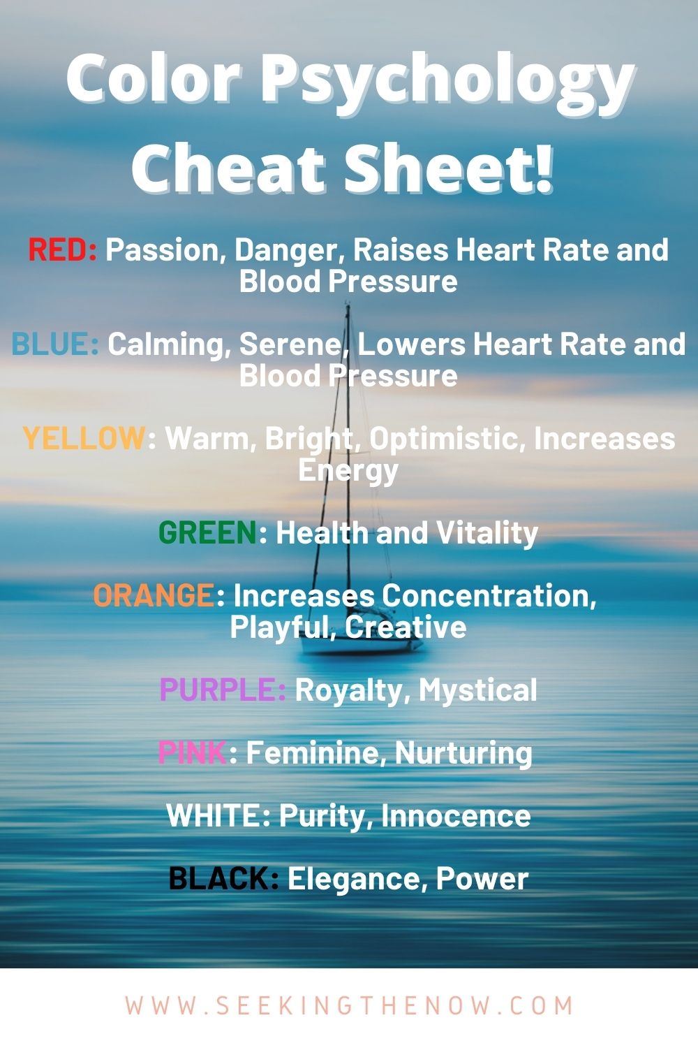
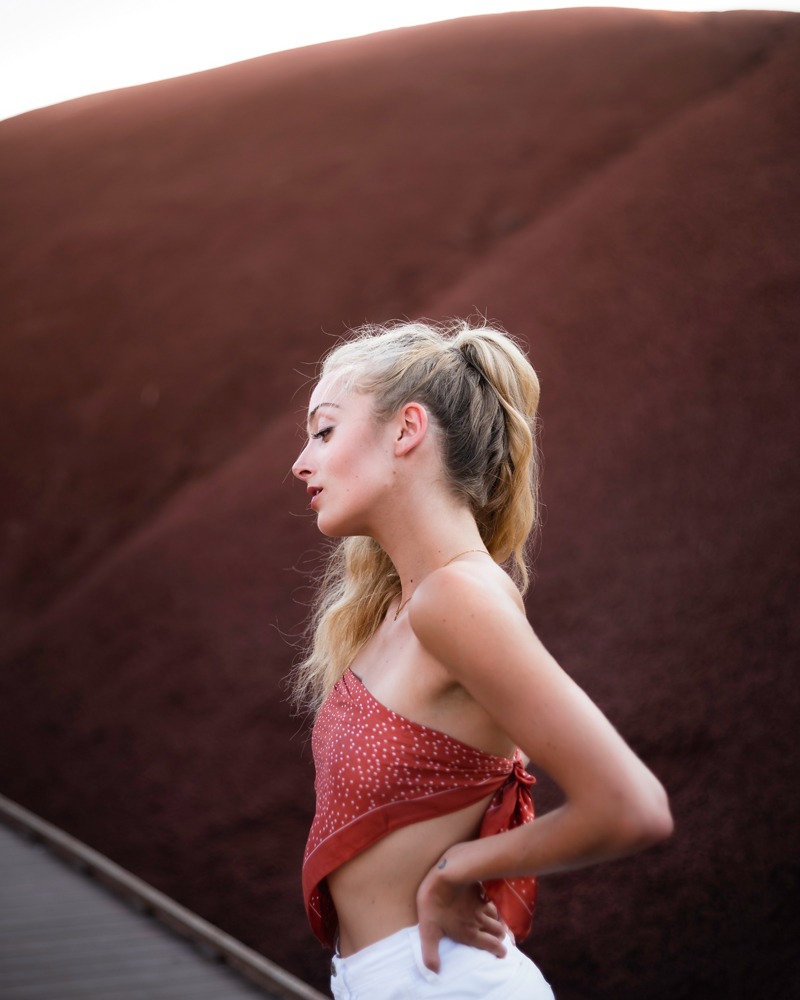
Color Psychology of Red
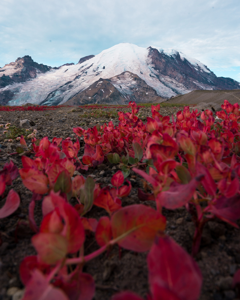
Red is considered the most “intense” color on the color wheel.
If we want to go a lil bit “sciencey” (not a real word, I know) with it we would know that because red has one of the longest wavelengths of all the colors it is one of the most visible colors, second only to yellow.
Red is used to grab our attention– think stop signs, boldd letters on a newspaper headline, fire trucks etc.
It is frequently used to indicate danger, possibly because of our previous association with fire and blood.
Physically, red has one of the most stimulating effects on our bodies. Simply being around the color red can:
- Raise blood pressure
- Increase heart rate
- Enhance metabolism
- Increase hunger
- Increase respiration
While red can indicate danger, it has another common meaning- passion and love.
A study found that while viewing the same woman dressed in red and blue, men ranked her as more sexually attractive while she was wearing the color red. (1)
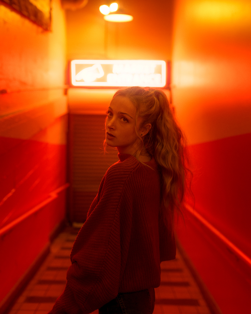
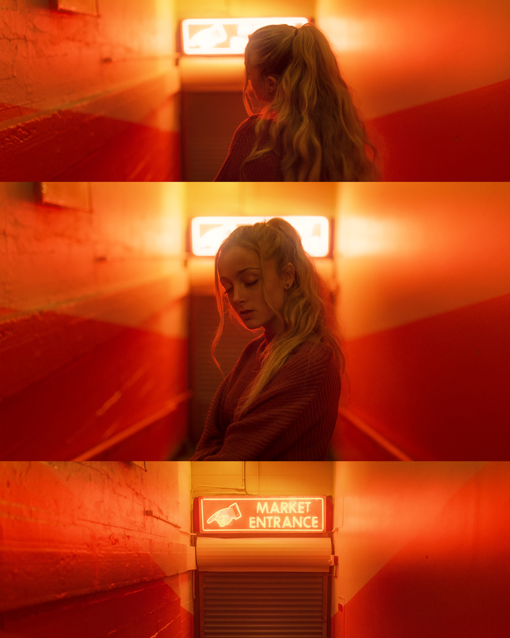
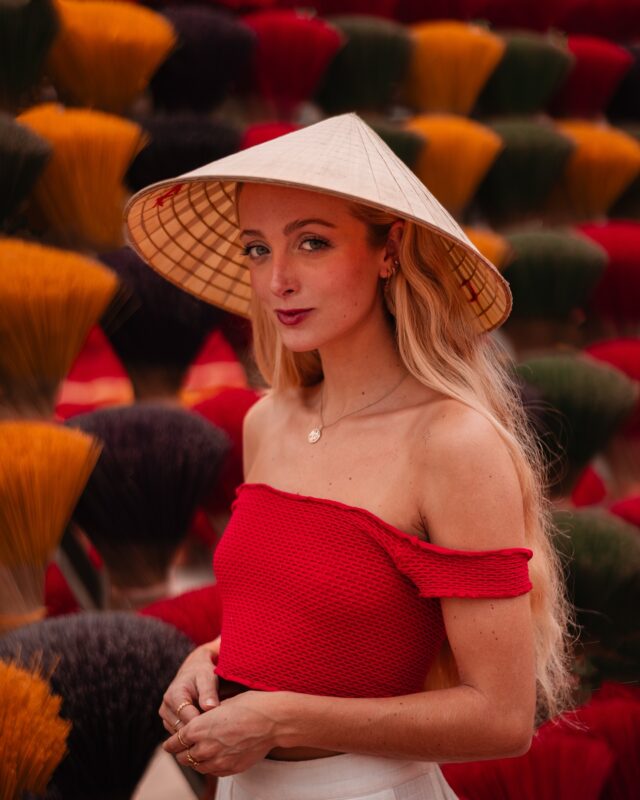
Utilizing the color red in image can be an impactful way to grab people’s attention and make them pay attention.
Red can also be used to showcase a subjects passion or emotion, show the relationship between two people or communicate danger.
Red in large amounts will physically affect your viewer- raising their blood pressure and heart rate. It can have a visceral effect that is unlike any of the other colors on this list.
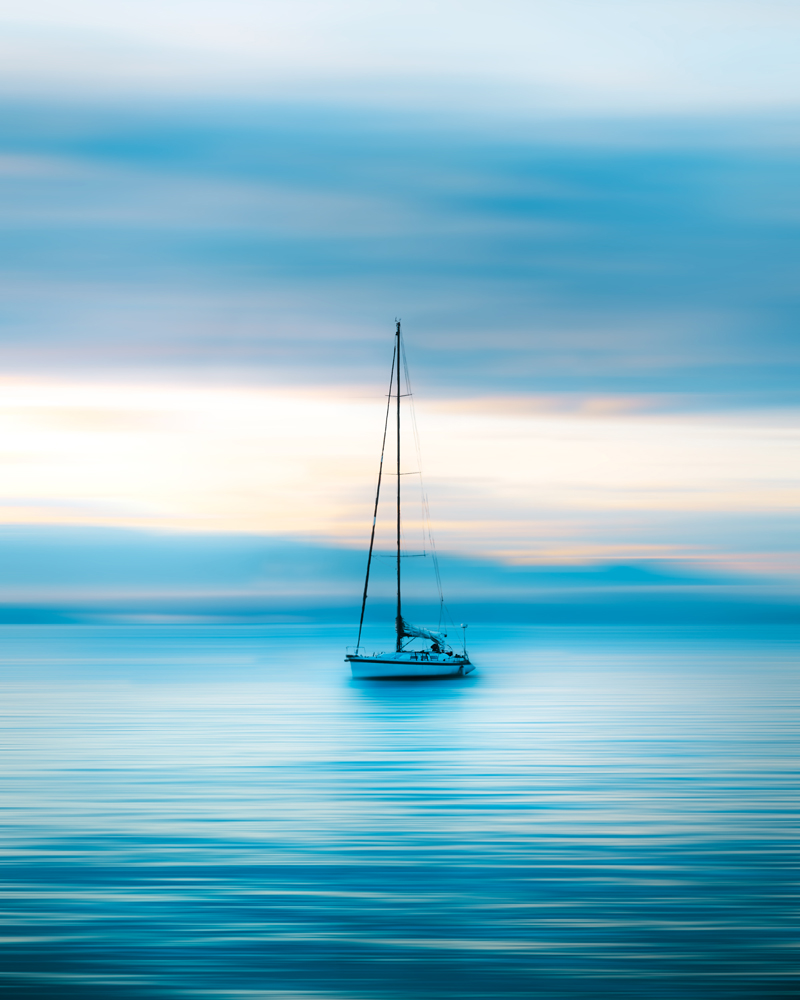
Color Psychology of Blue
Blue is about as far away from red as we can get- psychologically that is.
Unlike red, blue is associated with calm, tranquility, trust and harmony. It is reminiscent of the ocean and light blue skies.
Physically, blue promotes a very different reaction than red.
- It lowers blood pressure
- Lowers heart rates
- Decreases hunger
- It helps us think clearer
- Calms the mind.
Some say that while red is associated with the physical, blue is mental. A deep blue promotes productivity, while a light blue can help clear the mind and increase calmness.
While most blue is associated with serenity, there is a flip side to it.
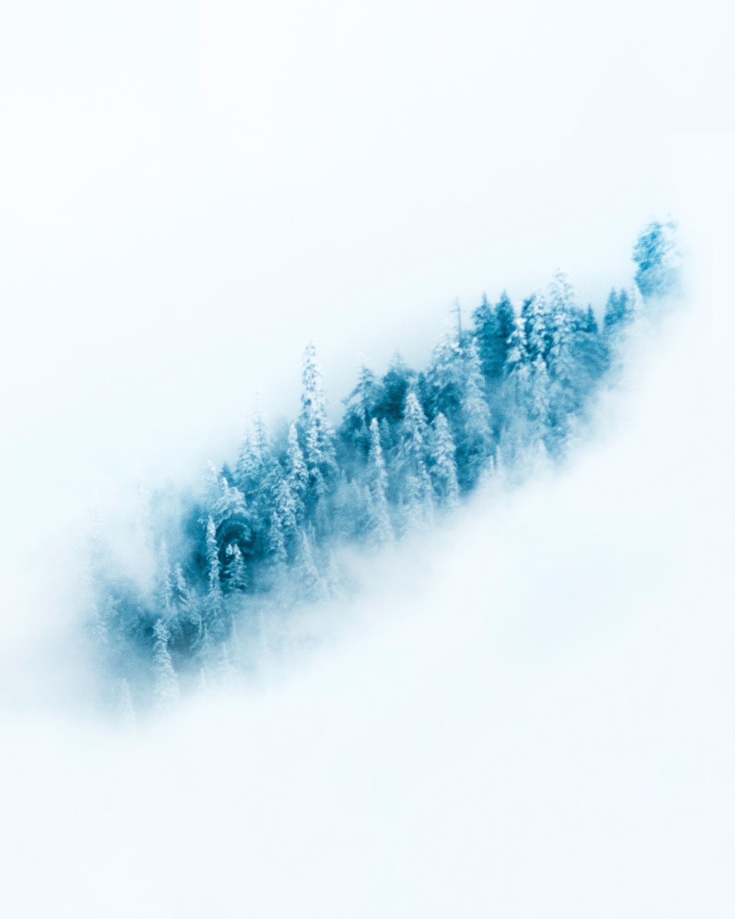
Cold, icy blues can increase a feeling of sadness. Even verbally people will use it to describe a sense of emptiness- “having the blues”
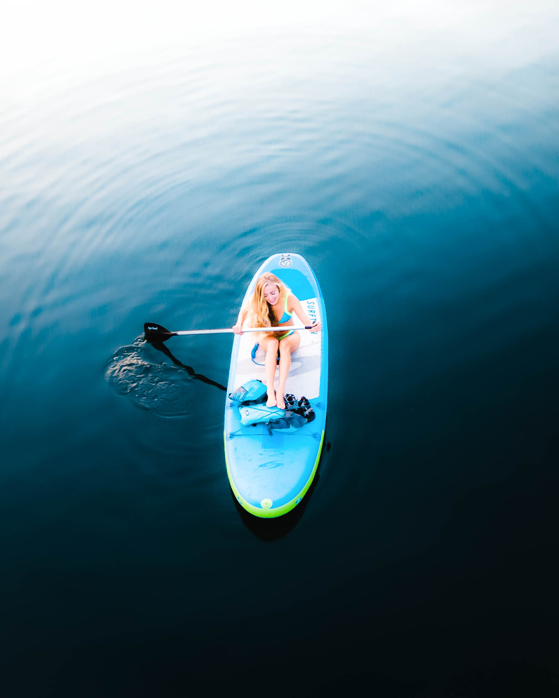
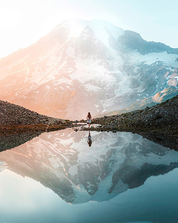
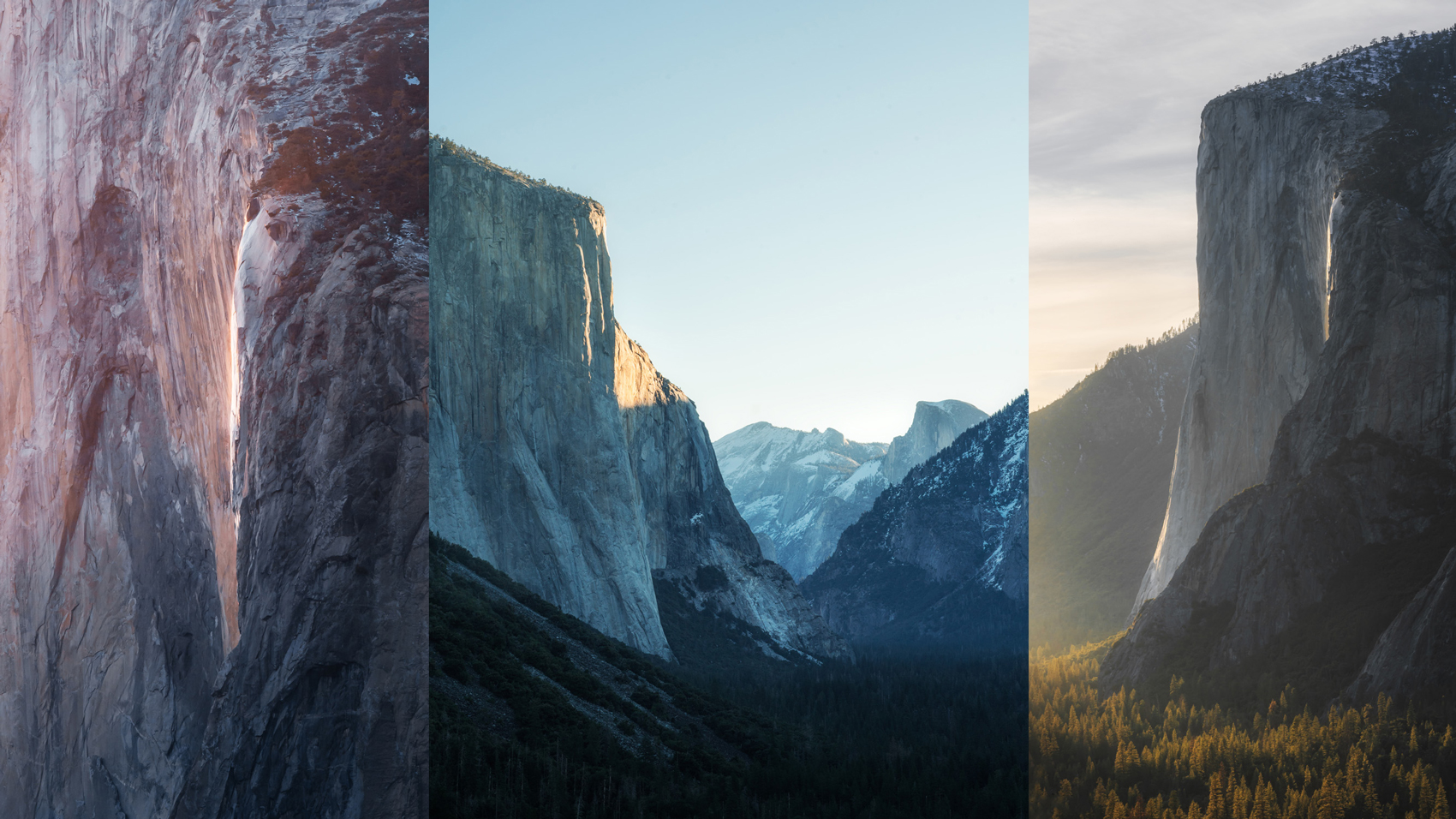
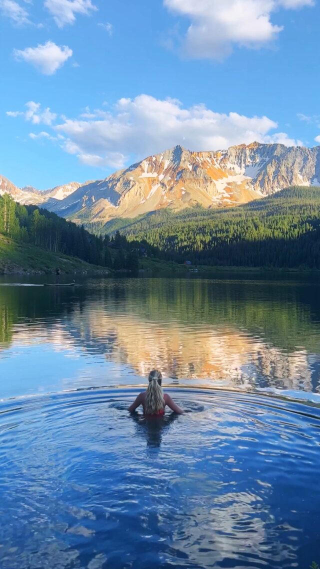
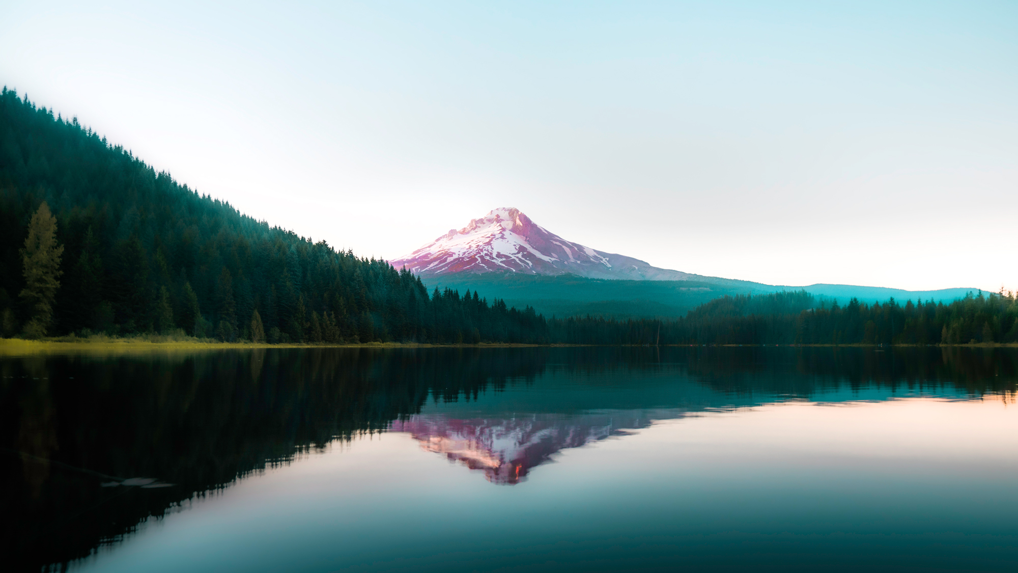
Utilizing blue in your images can be a wonderful way to increase a viewer’s sense of calm, serenity. It can be great to use in images that are meant to draw a viewer into a clear state of mind and help them focus or relax.
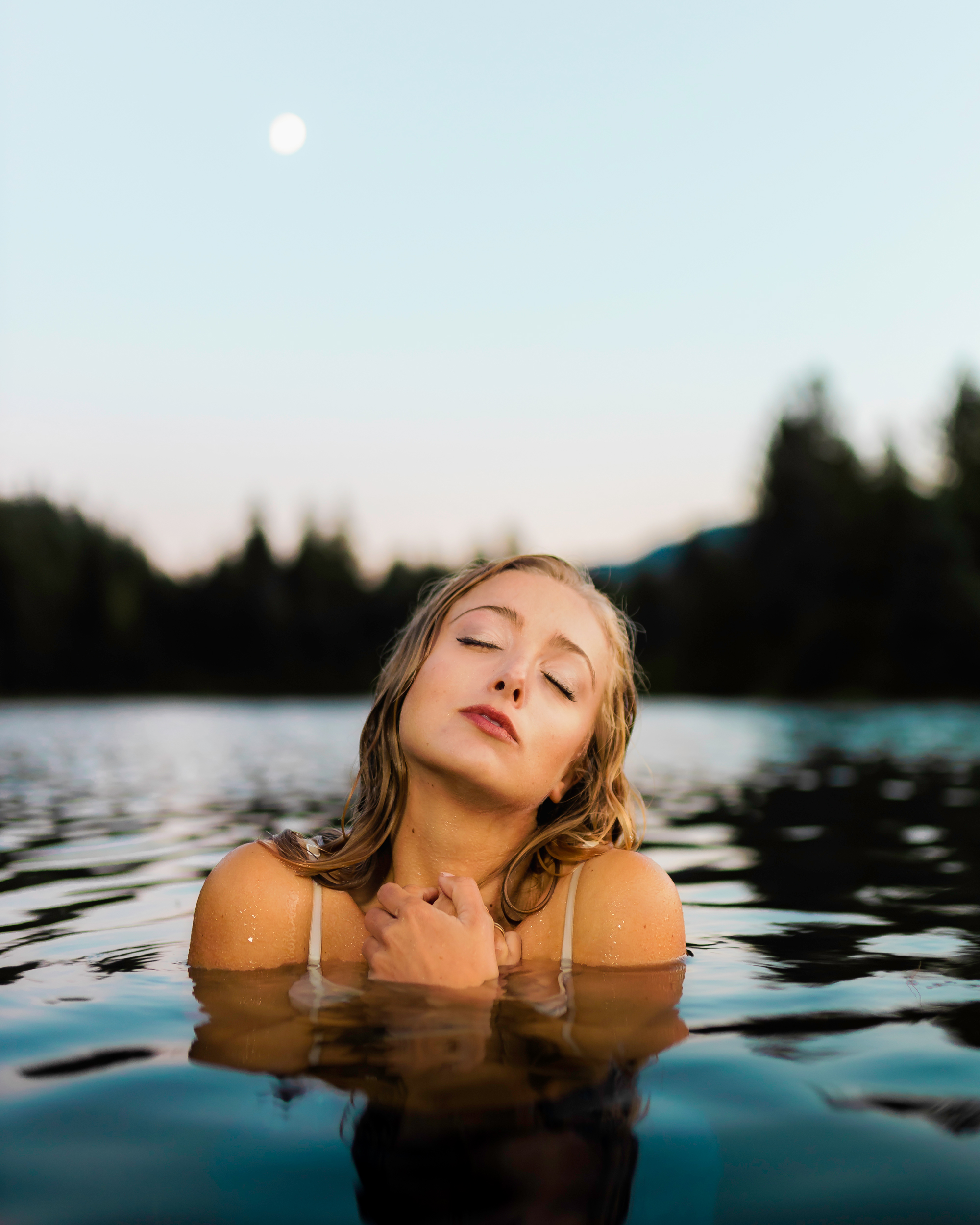
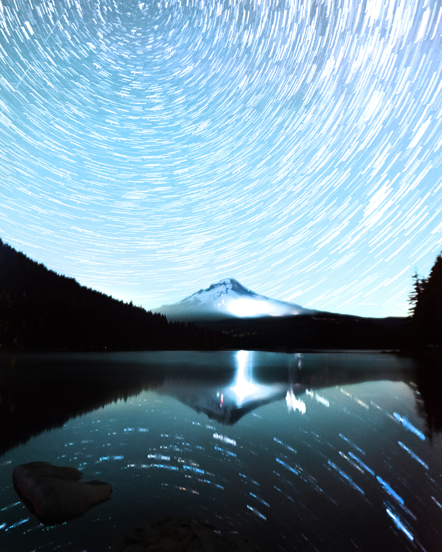
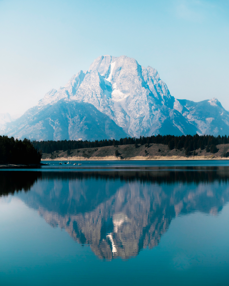
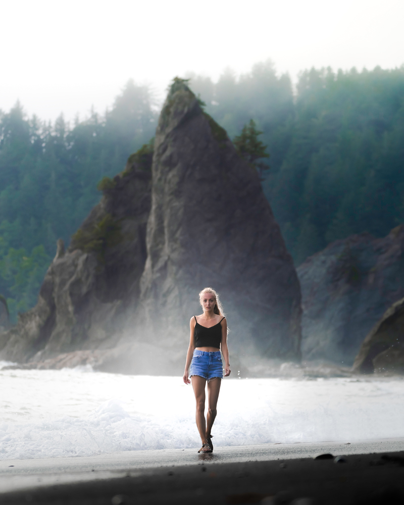
It is best to be conscious about the type of blue that you decide to use- cool blues will tend to give off a sad, more isolating vibe than deep, warmer blues. You can easily use this to your advantage to convey how harsh a landscape is, make an emotional statement or communicate your subjects emotions.
The Color Psychology of Yellow
The third and final primary color is yellow!
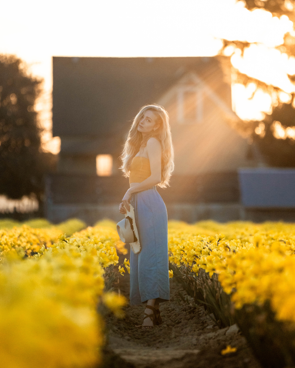
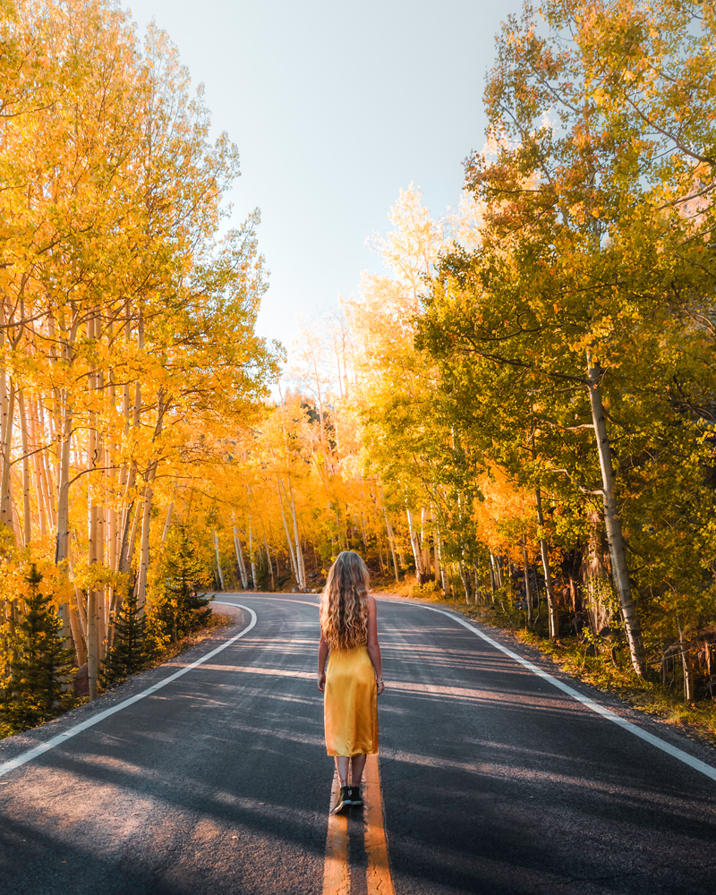
Yellow has the longest wavelength of all the colors in the visual spectrum and thus grabs attention quite easily. According to many, yellow is the strongest emotionally.
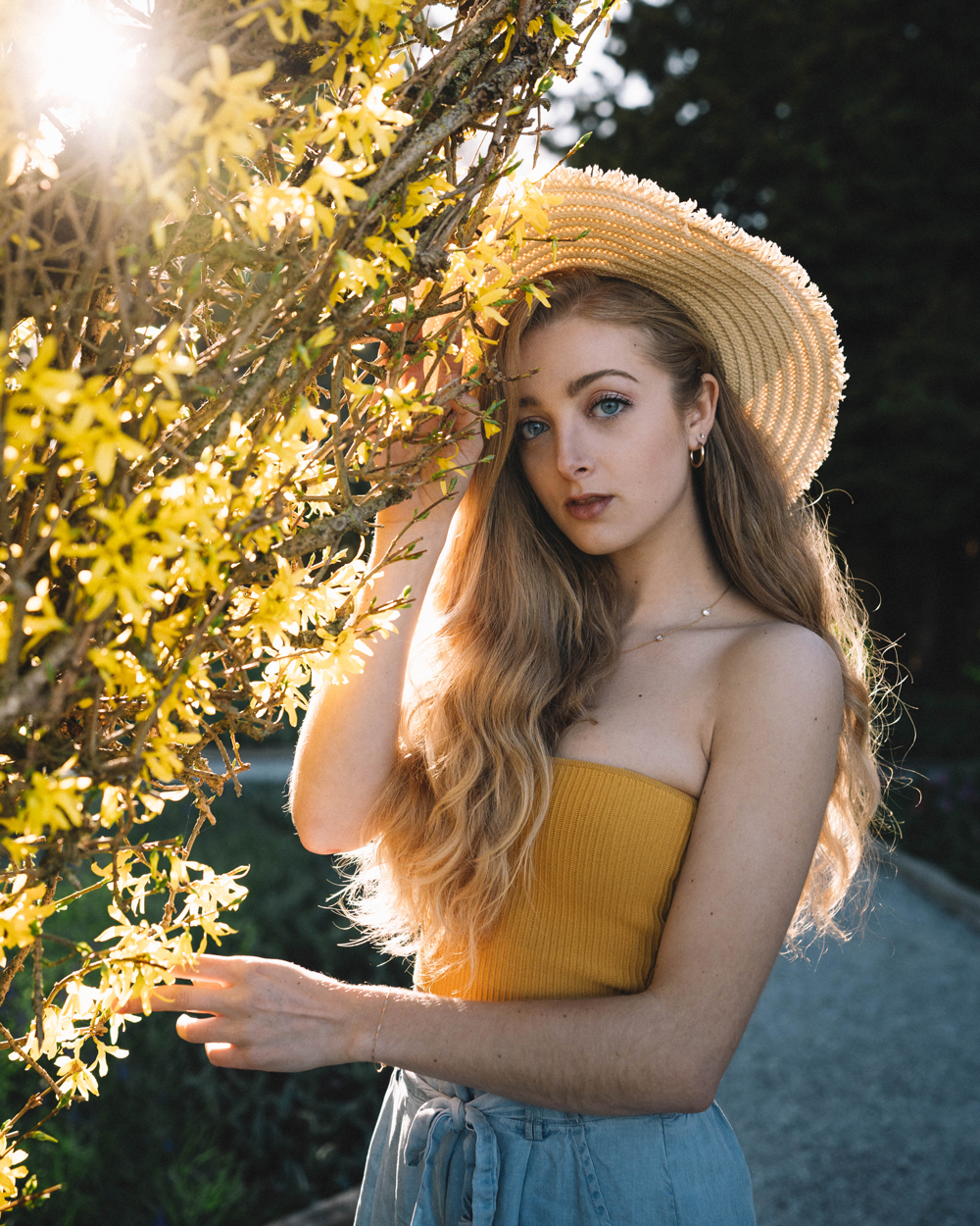
Yellow is likened to sunny days and happy memories. It can increase a person’s sense of well being, self esteem, and optimism. It feels warm to many and can increase energy.
Physically yellow:
- Increases energy
- Increases metabolism
- May be irritating and increase aggression
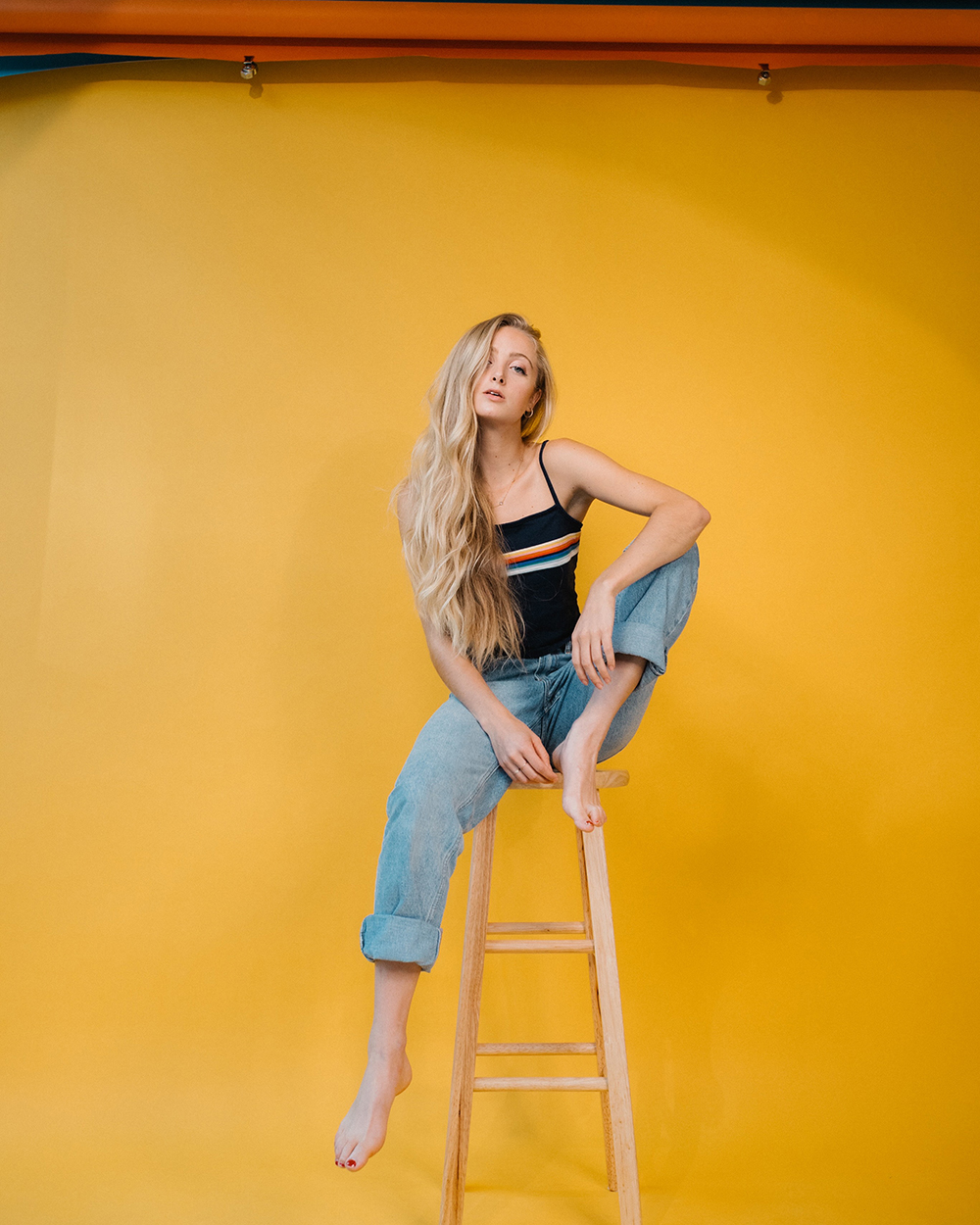
While to many, yellow can feel warm and bright it can also be much too intense. Due to its long wavelength and attention grabbing tendency, too much yellow can increase aggression and feelings of uneasiness.
When utilizing yellow in your images it can be good to keep in mind the two sides of this color.
Many times it can be too stimulating while used in large swatches and affect your viewer viscerally.
This may be the exact response you are looking for or you may want to tone it down to produce the happier, more optimistic side of yellow.
Secondary
Secondary colors are colors created from blending two of the primary colors- these include green, orange and purple.
Color Psychology of Green
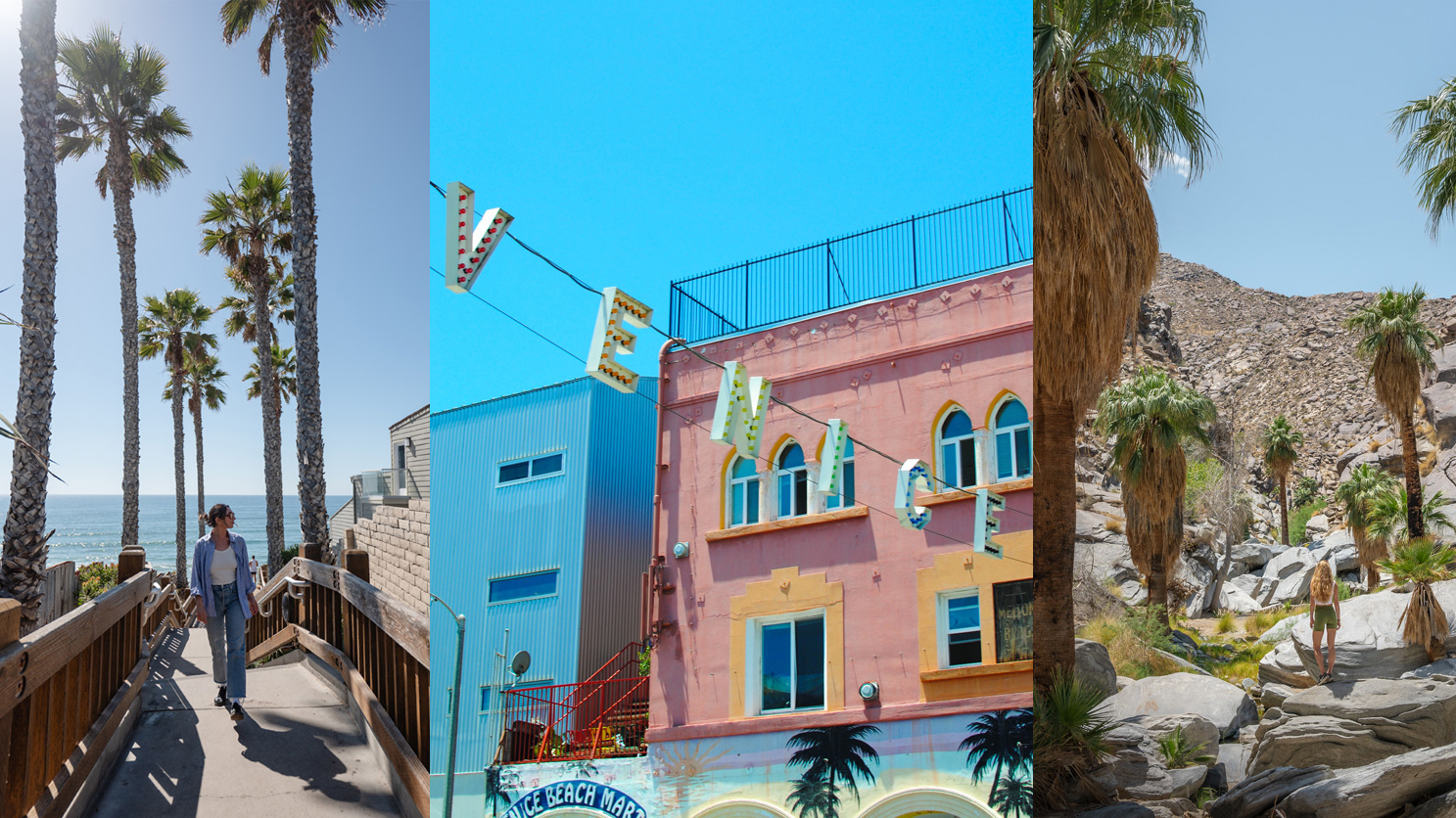
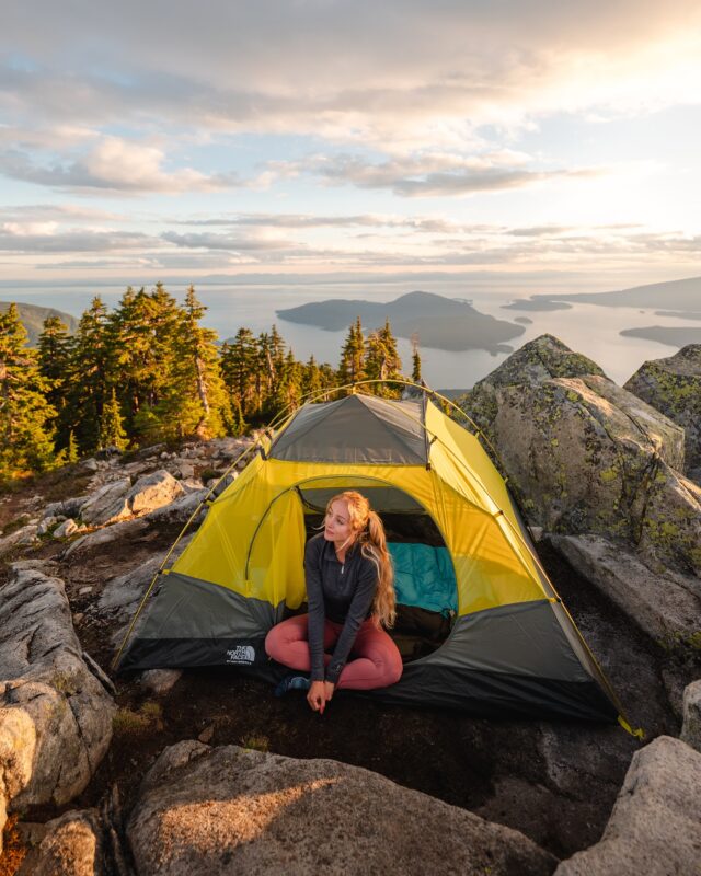
One of my favorite colors to use in images and surround myself with, green, the color of vitality!
Green sits at the center of the visual spectrum and thus feels balanced and restful to many.
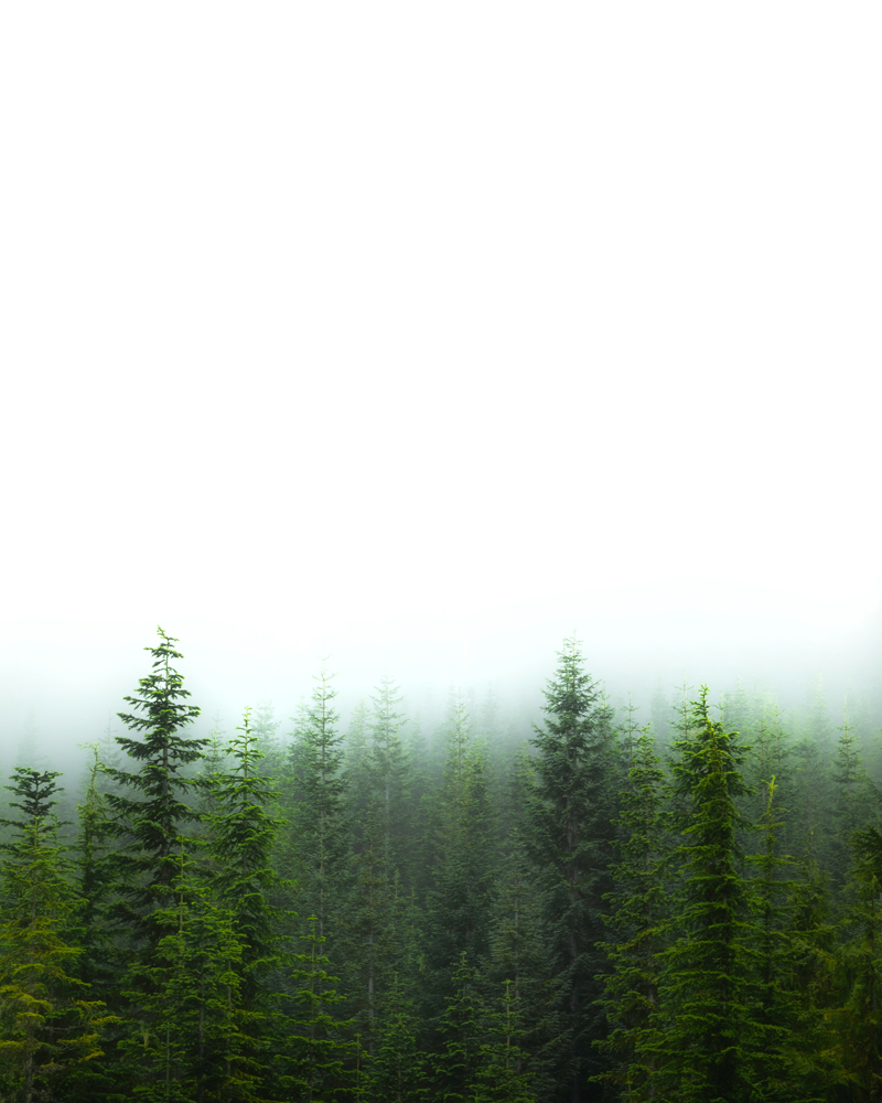
If you have ever headed out on a forest walk you know just how healing the properties of green can be.
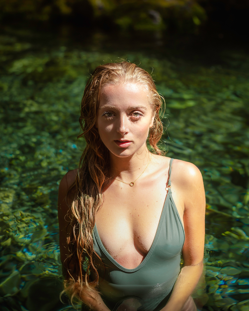
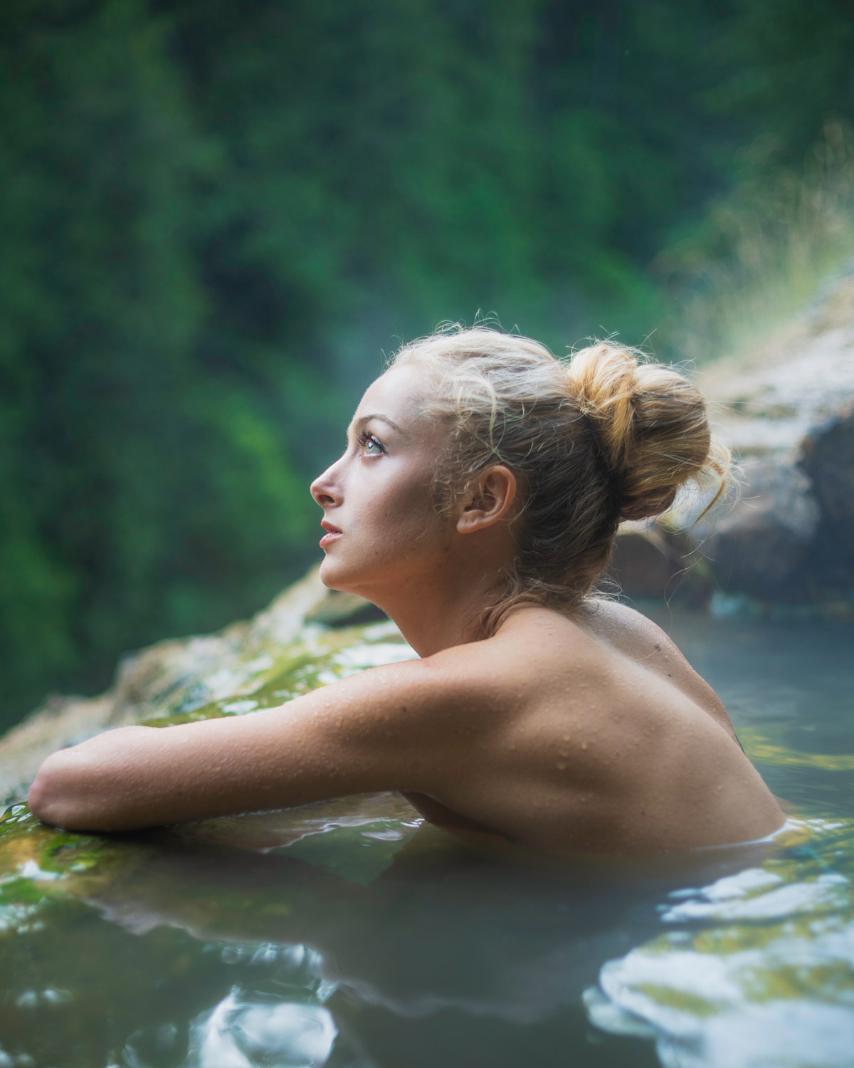
To many, green represents nature, growth, vitality and health. It can be a wonderful color to surround yourself with as it can bring in the calm, vitality of the natural world.
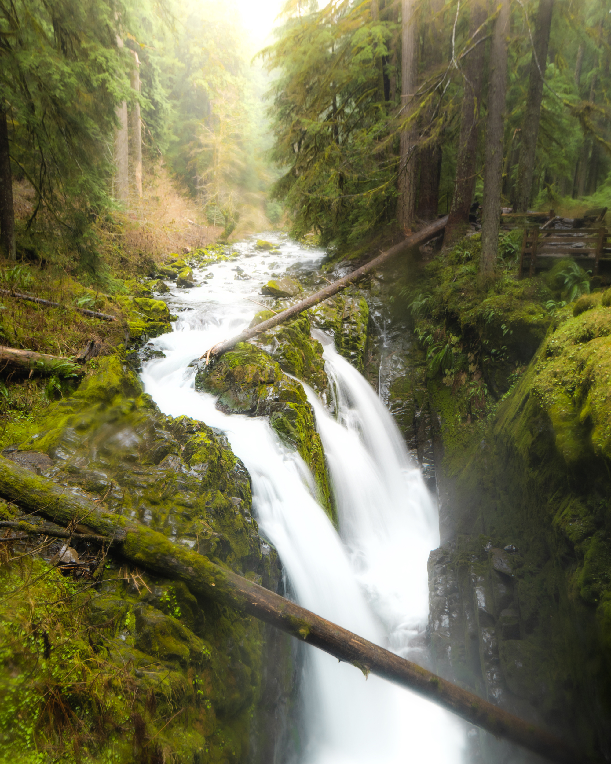
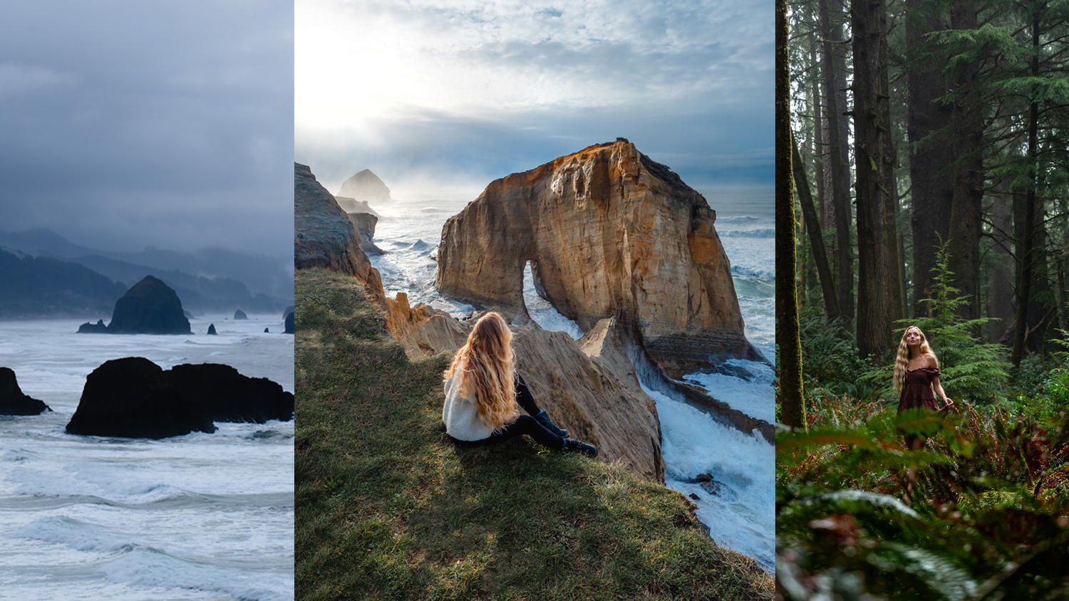
Green is wonderful to use in images where you want to send a message of optimism, growth, vitality and health.
A light- yellow tinted green can send the impression of “freshness” while a darker green is more indicative of stability.
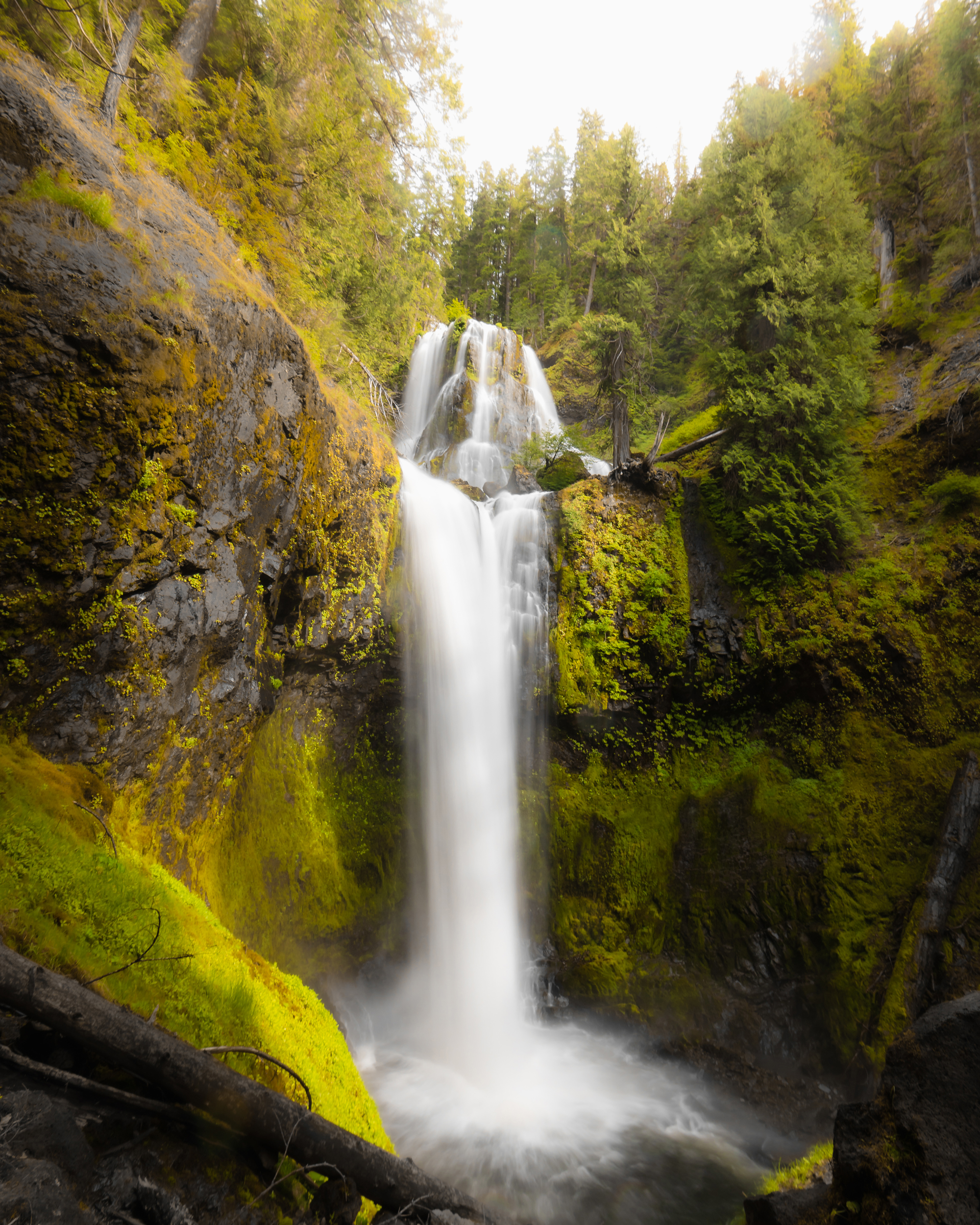
I personally love using a bright green in my images- I like to think it captures the feeling I get when I am sitting in a lush park or next to a fresh waterfall.
Color Psychology of Orange
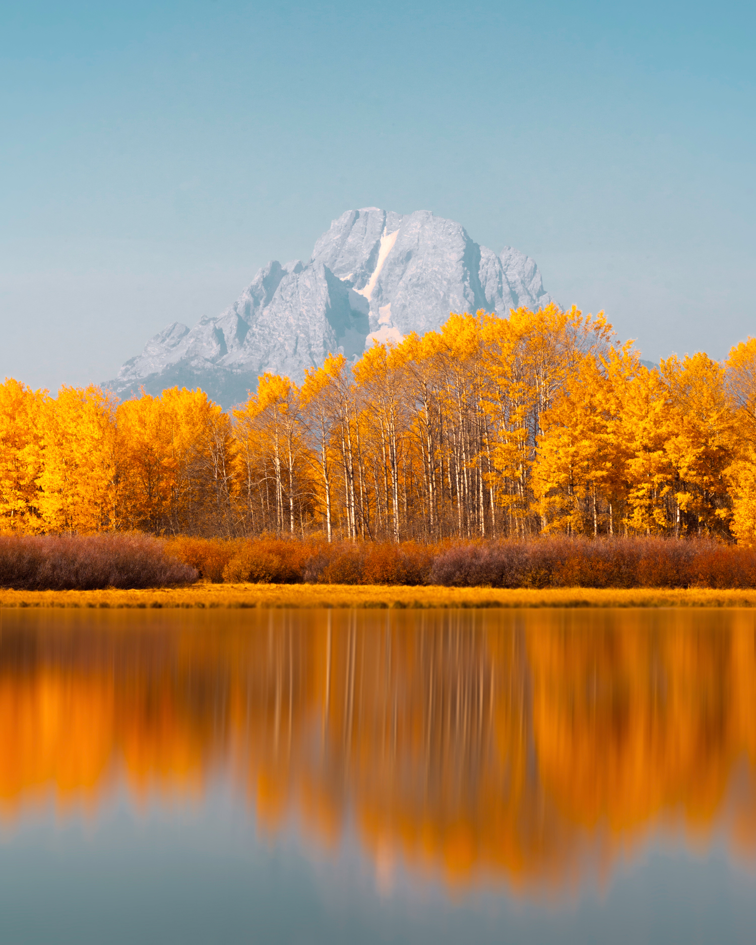
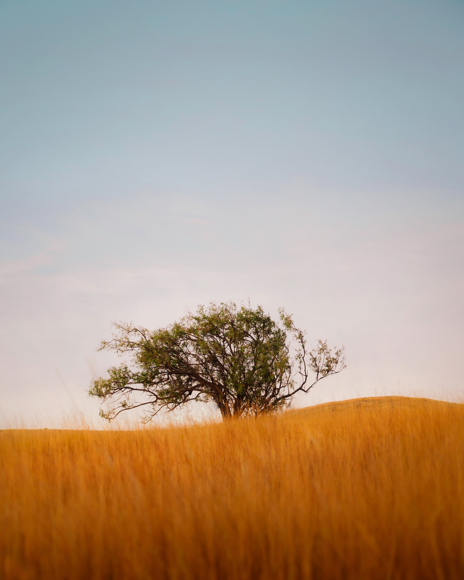
Orange is associated with creativity and youthfulness! Orange is in many people’s opinions the most fun of all the colors.
The combination of red and yellow makes it a stimulating color and can grab attention quite easily.
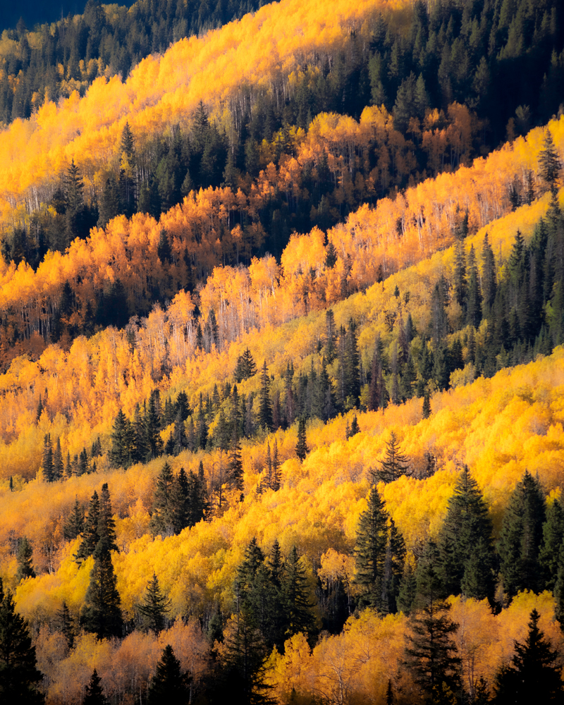
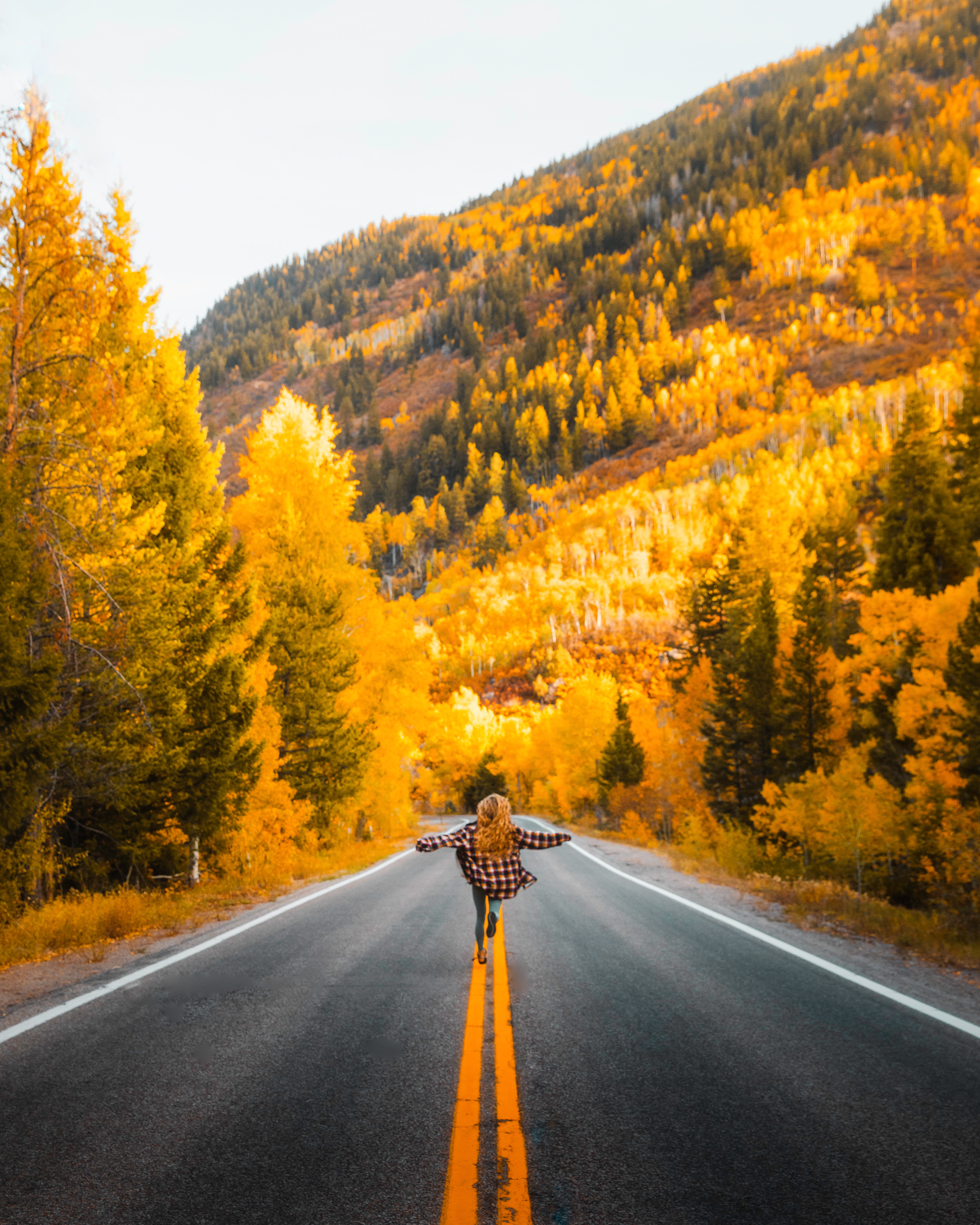
Many people associate the color orange with autumn leaves, sunsets, and Halloween.
Orange can be thought of as warm and inviting, happy and uplifting, and friendly!
It is an energetic color and can actually increase concentration.
Utilizing orange in your images can increase your viewer’s energy and help them view the scene as happy and invigorating!
Color Psychology of Purple
Purple is the shortest wavelength on the spectrum and thus the least intrusive.
It is associated with royalty, spirituality and imagination.
In ancient times purple was one of the most difficult dyes to make, if you had purple apparel you were either very wealthy or royalty.
Purple is one of the more elusive colors- many seem to associate it with the mystical and dream world.
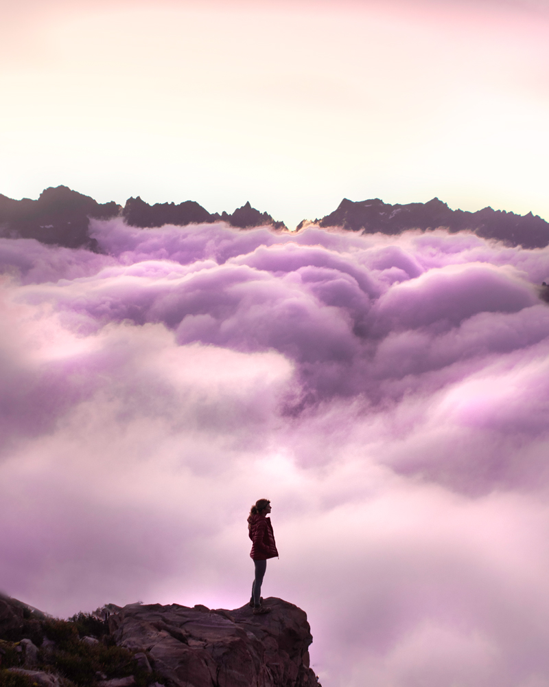
Utilizing purple in your images can create a sense of dreaminess, it can elevate your images to the dreamworld and communicate a mystical feeling none of the other colors possess.
Color Psychology of Pink:
Pink is a form of red, and while most of the other colors simply call their shades a “light blue” or “dark green” pink is special and gets its own name.
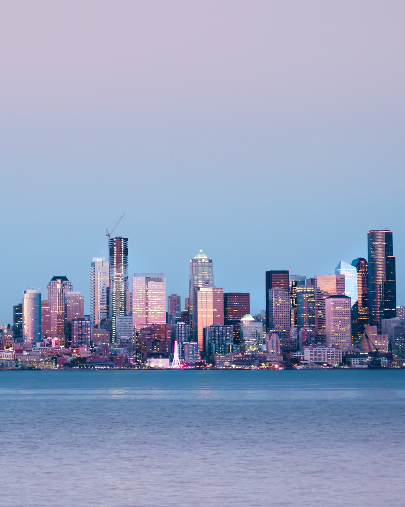
Pink as many of you can guess is associated with love, admiration, affection and everything feminine. Unlike red, pink is a soothing color- it evokes a feeling of nurturing rather than that of passion.
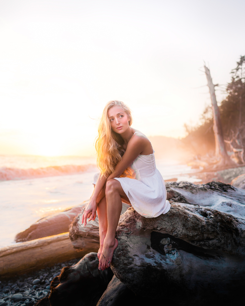
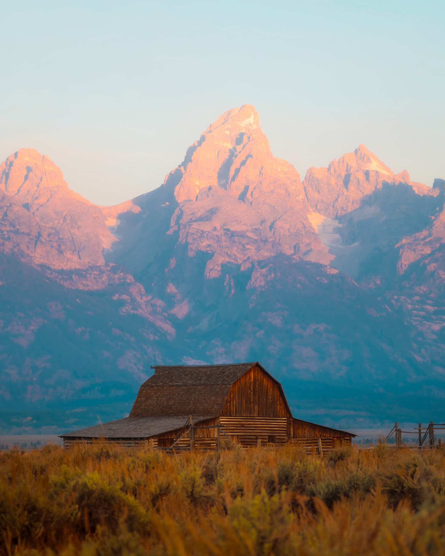
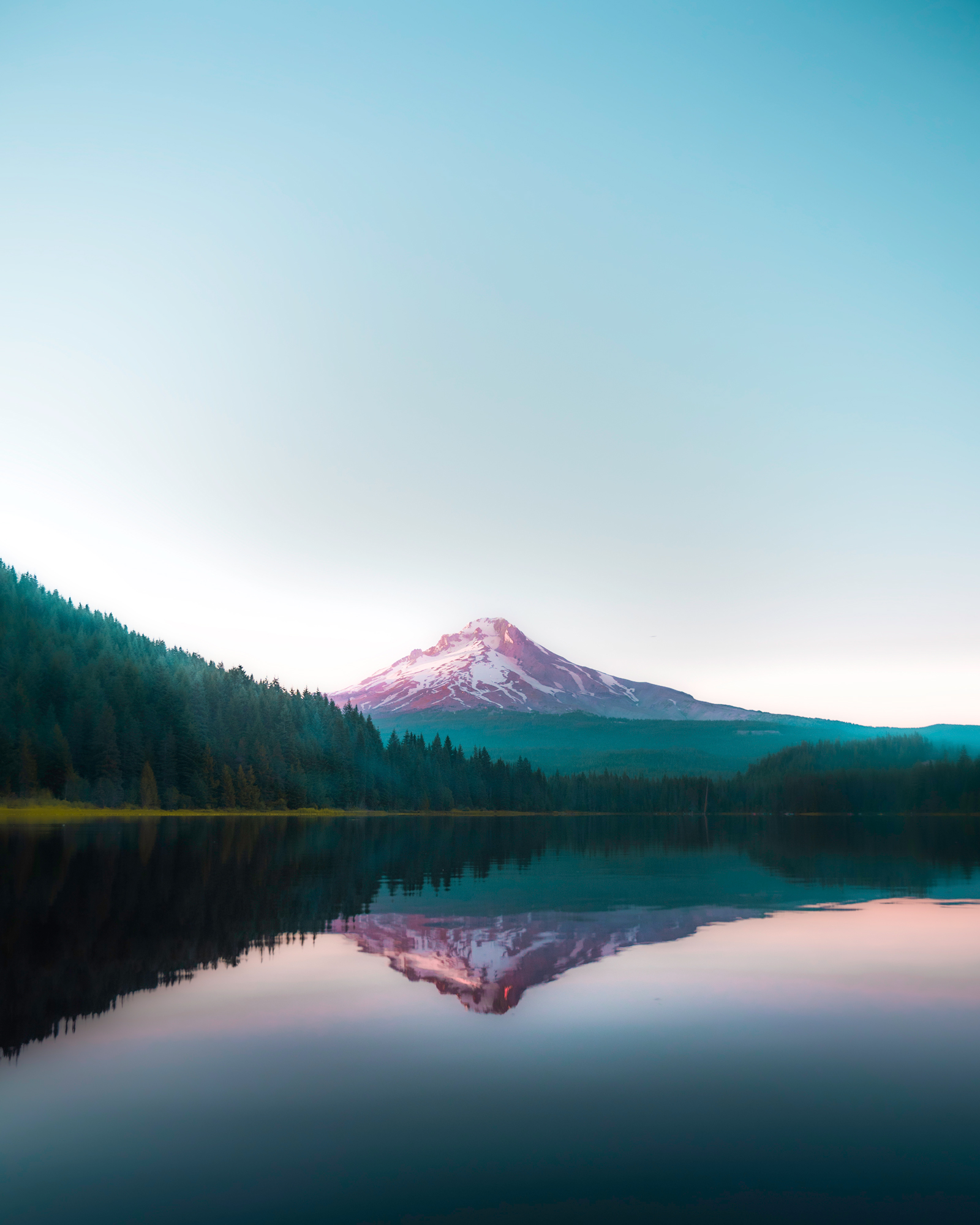
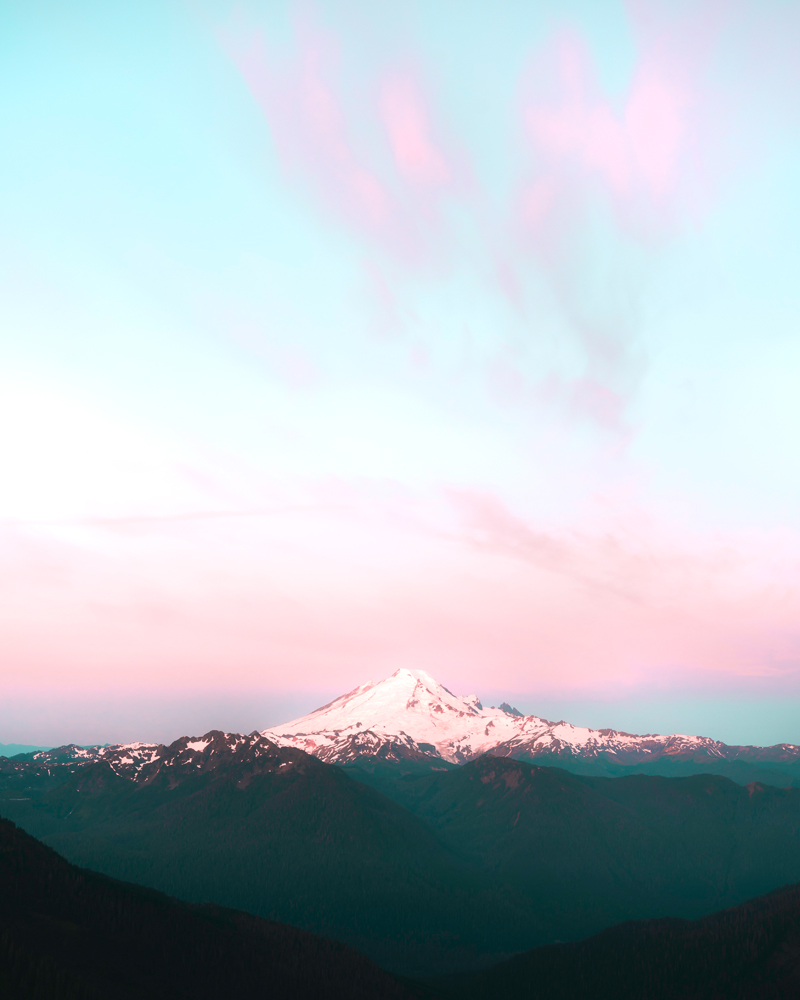
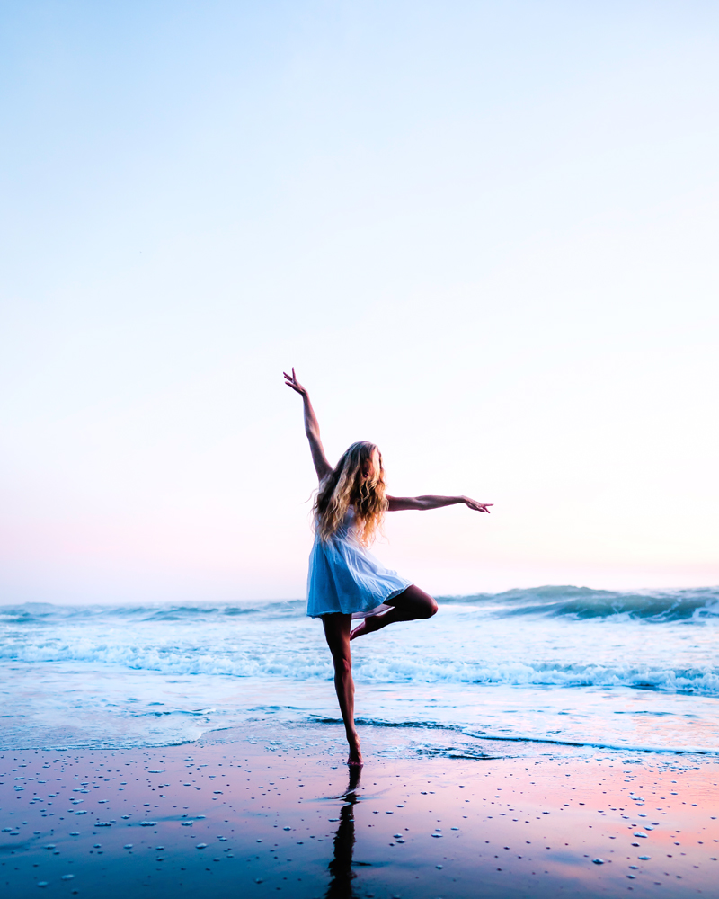
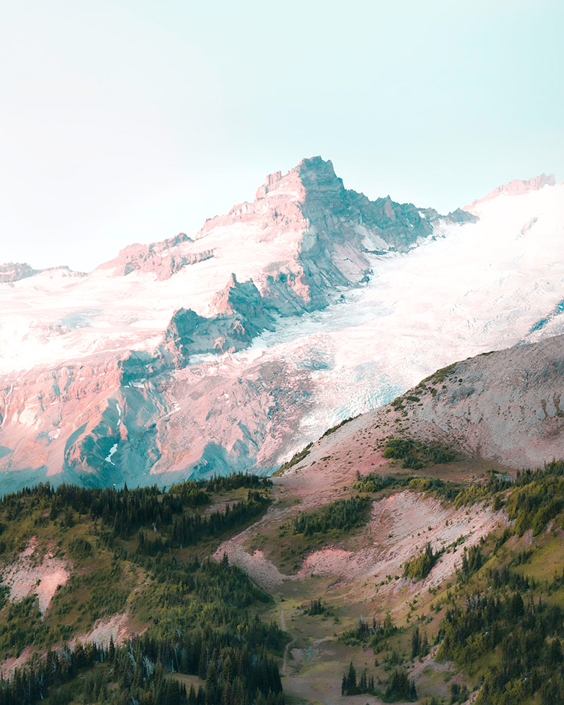
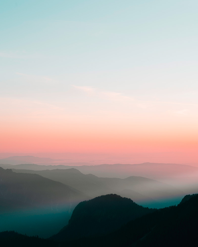
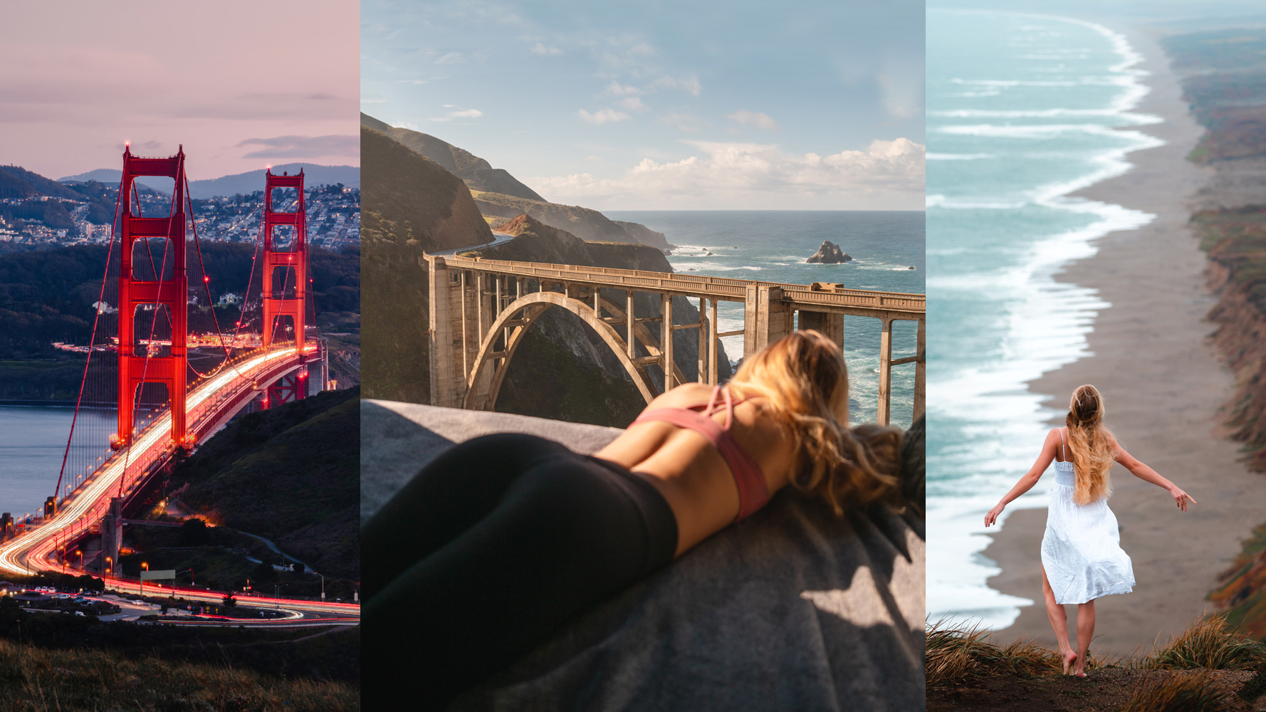
Using the color pink in your images can bring in a feeling of warmth. A pink sunset or dress allows for a feminine softness that calms the viewers and pulls them into a feeling of being nurtured.
Black and White
White is the reflection of all of the colors together.
White will normally symbolize purity, innocence, and sterility.
It is used in hospitals to showcase cleanliness and in churches to showcase purity and dedication to god.
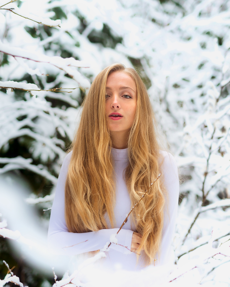
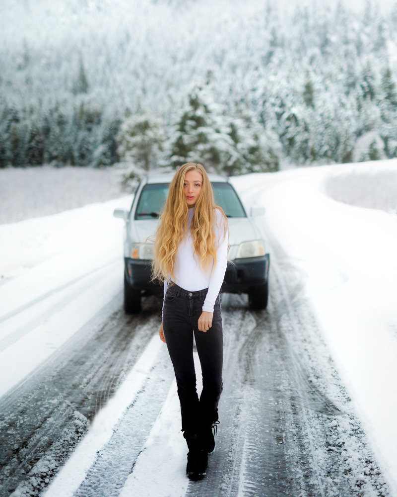
In images white can be a great way to establish clarity, simplicity and contrast.
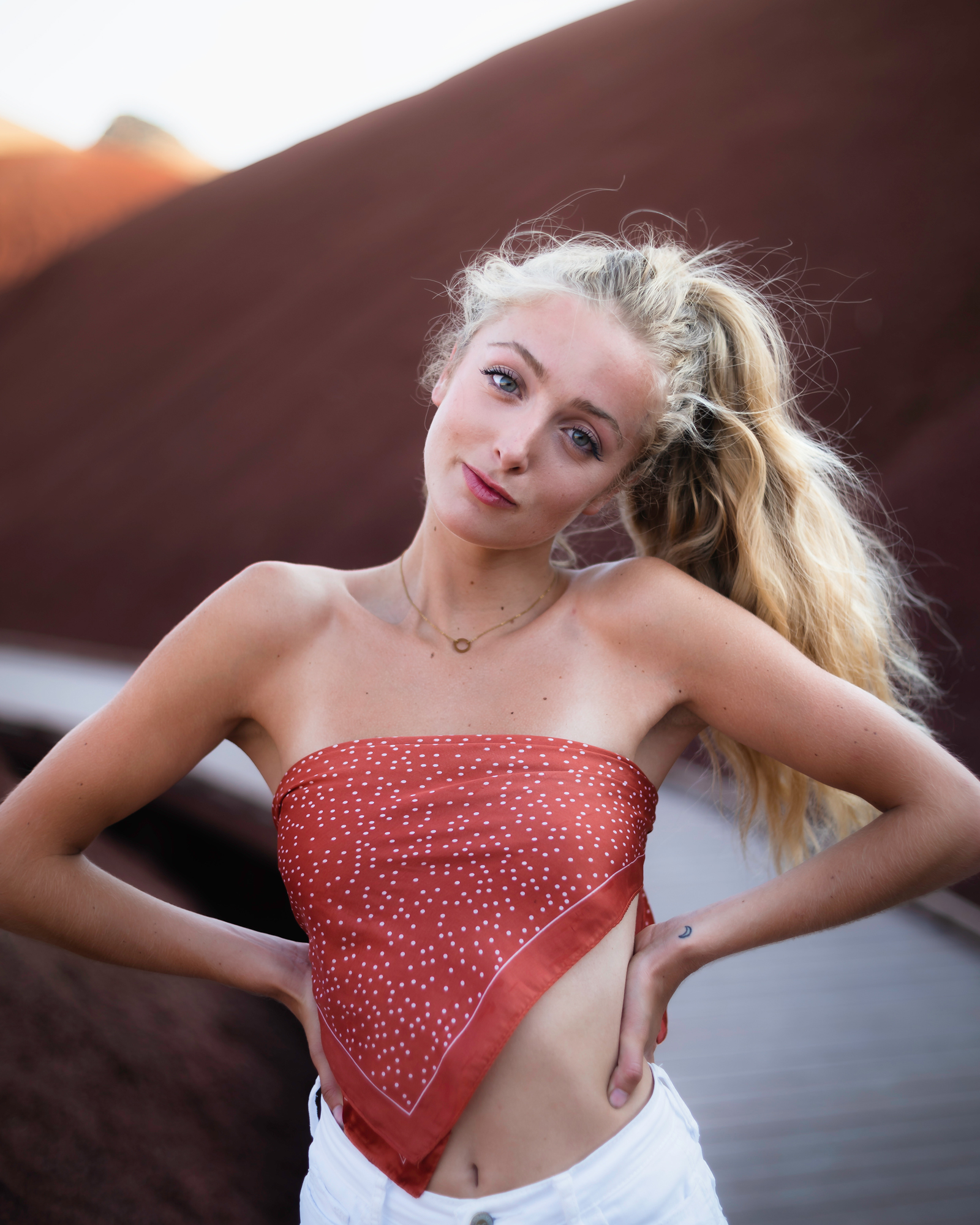
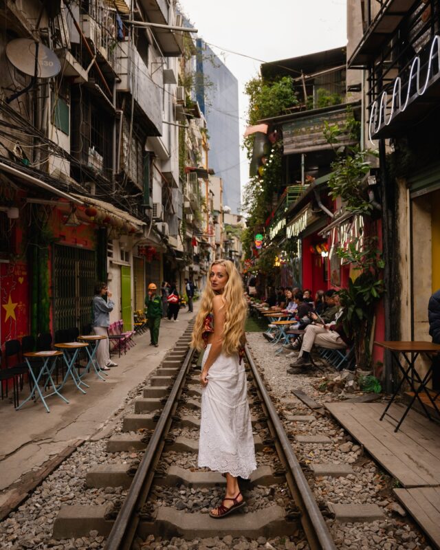
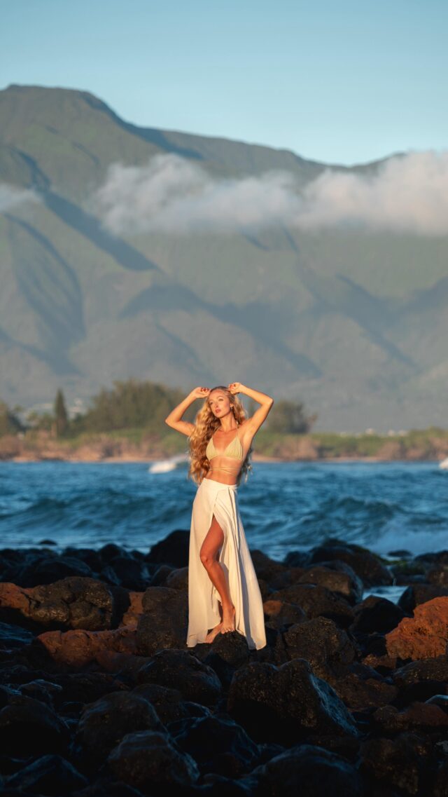
Many times I will use white clothes as they tend to pop within any environment.
Black on the other hand is the absence of color.
It normally represents elegance, durability, high class, grief and mourning.
Depending on the amount used black can be a wonderful accent to an image to establish contrast or can be an overwhelming statement.
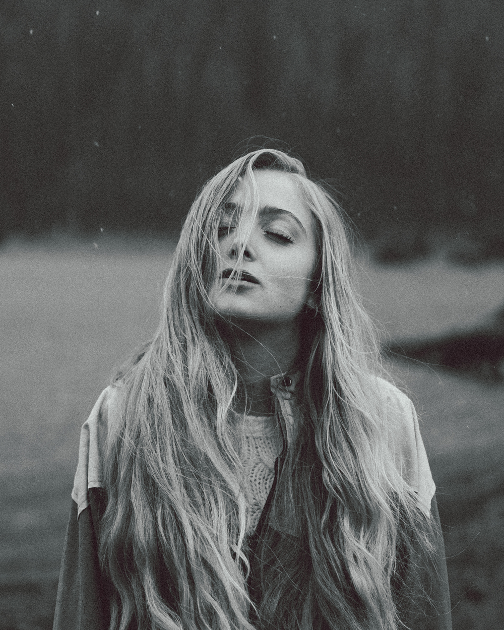
Black and white photography as a whole normally represents longevity and timelessness.
It can be less distracting than color photography and allow the emotions of a subject to shine through.
Black and white photography can also be great for street photography as it emphasizes the shadows and light passing through architecture in an interesting and dynamic way.
“When you photograph people in color, you photograph their clothes. But when you photograph people in Black and white, you photograph their souls!” – Ted Grant
Conclusion
The impact of color is unquestionable.
By consciously utilizing an understanding of color psychology we as photographers can help guide our viewer towards the sort of emotion we wish to communicate.
Recent Posts
Shop With Me on Etsy! Click A Photo Below!
Join Me on Instagram!
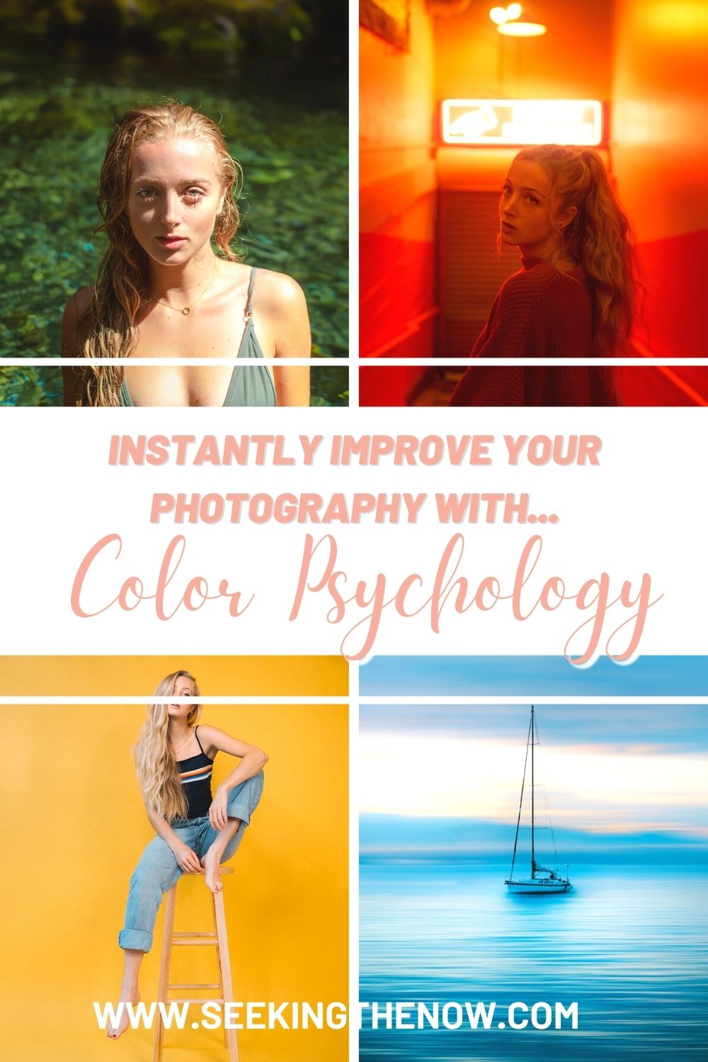
Pin it for later!
Want More?
The Ultimate Guide to Adventure Photography Gear- for the Avid Hiker
This article is the guide to adventure photography gear I wish I had started out with. This guide is perfect for those who are heading out to explore the hiking trails near them and want to start capturing the beauty around them!
5 Tools That Will Help You Find Those Amazing “Instagram Worthy” Locations
Instead of giving you locations I thought I would teach you the ways to research just like the professional adventure photographers do!
This way when you decide to head to a new area, seek out that one shot you have always wanted OR simply want to find the prettiest hike near you, you are armed with all the same tools they are!
How to Create A Concept that Will Take Your Photo Shoots to the Next Level!
A concept is what takes your photograph from simple documentation, to art.
A concept is essentially an idea or goal that grounds the entire project, it is the touchstone for every decision that is made and helps keep the project cohesive.
How A Gratitude List Can Change Your Life- Amazing Lessons from Nueroscience
Self help books tout gratitude lists as one of the first steps to changing your life, morning routine videos on Youtube are sharing it as one of the steps “successful” people use to get themselves ready for the day and self love bloggers and influencers are vlogging their routines around it.













0 Comments